Want to join me in an informal KAL? I’m going to be knitting another Pomball:Zig since I want to show you some tips and tricks about pomball hats and colourwork. (And I want my family to have a version of the hat they’re allowed to wear because they keep threatening to steal my sample!)
Let’s start with the obvious: colour choice. It’s a colourwork hat, and picking colours is both one of the best parts of colourwork and the most paralyzing. I’ve got 2 tricks to make the process less mystifying.
Colourwork gives you the whole rainbow to choose from but I don’t start with colours. I always start with identifying what I want from the finished piece. What really makes me passionate about this project? If you’re a newsletter subscriber, you’ve already gotten a link to this free Yarn Substitution Guide. It’s not a technical yarn guide but more of a style guide – helping you to focus on what look you want to convey, what you want from the finished piece. Those are the kinds of dynamics I start with when picking yarns and colours for a project.
Here’s an important question to ask yourself: “What do I want to be the focus?” The answer might be ‘Me!’ and then you’ll go for a yarn combo that flatters you but doesn’t compete for attention near your face. Or the answer might be “I want the brim to be the focus” or “I love that central motif”.
Only once I know what look I’m going for, even if I’ve just narrowed it down to ‘graphic contrast colours’ or ‘quirky’ or ‘harmonious colours and feminine’, do I start to look at the actual colours.
Trick #1: Outfoxing our colour-loving minds by using black and white filters
Colourwork really lives and dies by yarn shades. By this I mean the light and dark differences between your colours. Two colours of blue can have a lighter shade and a darker shade, and it is this contrast almost more than the colours themselves that makes colourwork pop. There is a rhythm of light and dark that works with our colour choices or against them. Our eyes and brains work pretty hard to fool us, though.
Here are some examples of colour combinations and what they look like in black and white:

Sometimes our minds just really want to see something as bright because of an emotional association we have with it, but it’s actually more of a middle shade. (I’m often fooled by greens for instance.) Sometimes colours seem really bold and fantastic, but they’re too close in shade to make for a good design because they’re all calling for the same kind of attention. The top left colours, for instance, are fantastic superhero-like colours. But you can see in the top right-hand picture that all three are nearly identical in shade. They’ll have no rhythm and will just be calling to our eye at the same level of intensity.
In the bottom row, however, there are some differences going on that will help provide that rhythm for the eye. The pink and the charcoal provide medium and dark bookends. It’s not a very wide variety, though, and some swatching would be in order. (Swatching is always going to be in order, but especially with colourwork.)
Here are photos of two of the hats in this collection:
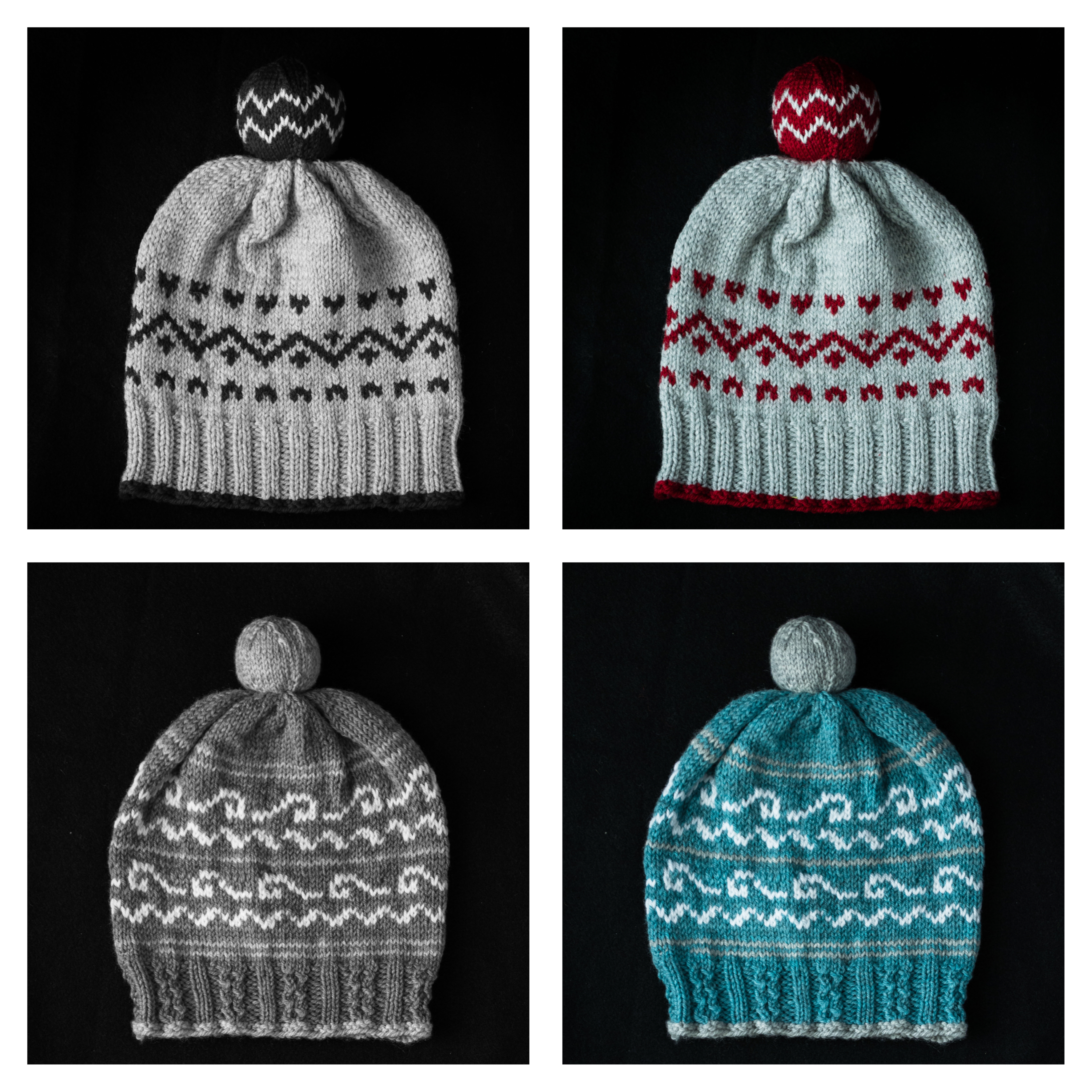
Pomball: Zig and Pomball: Waves are both colourwork hats knit in Cascade 220 Superwash, and I went with very different approaches in terms of contrast. Zig has a bold contrast while Waves has a colour palette that works with harmony. I picked the blue and grey to be very close and, while the white does pop, it still isn’t hugely different (especially in real life when it’s not against a black backdrop).
Trick #2: Yarn wrapping before swatching
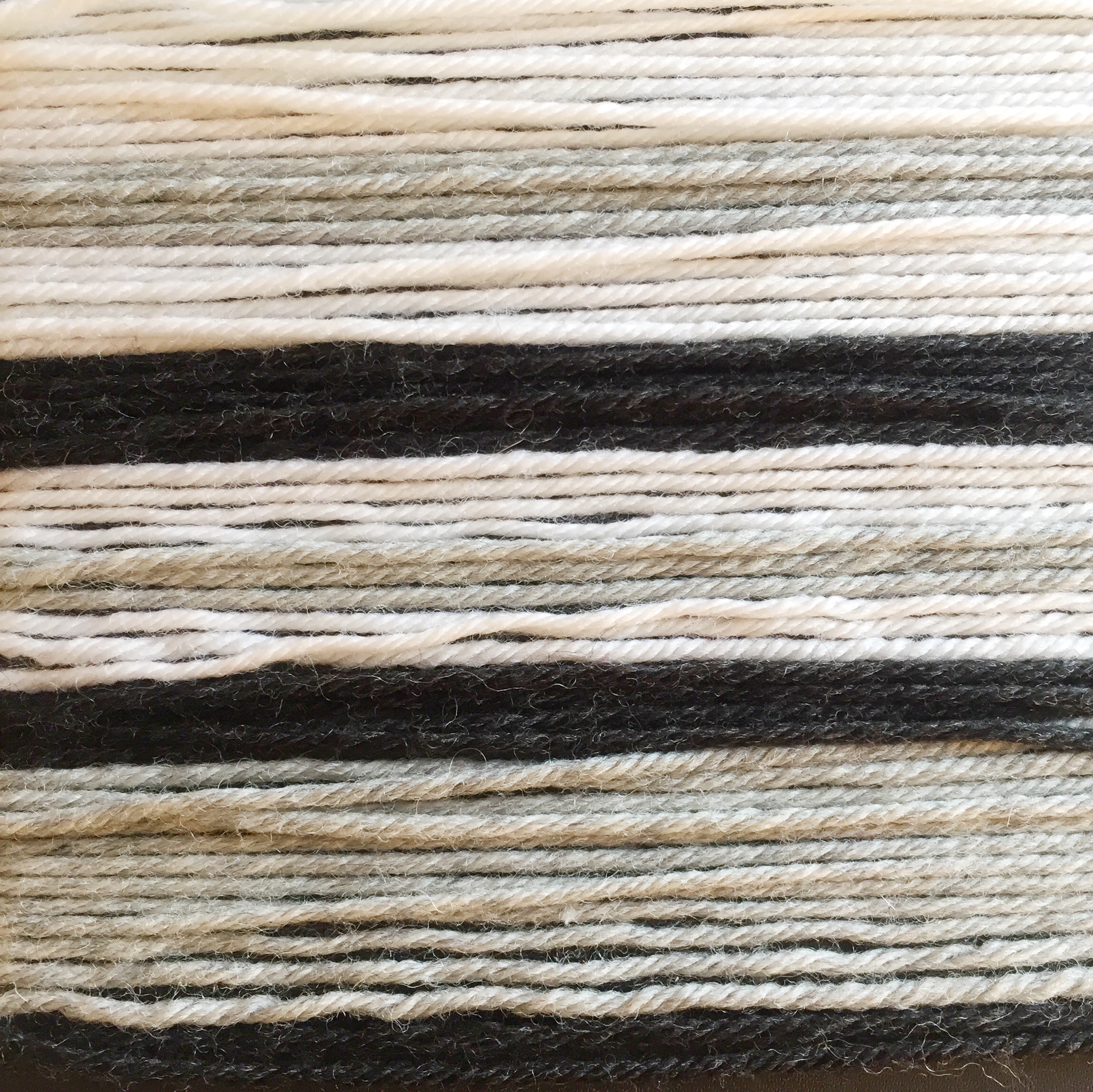
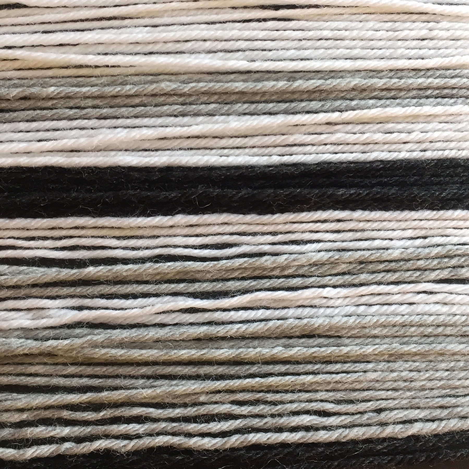
Give those colours a trial. Before you even swatch the combinations, you can get a good sense of how balanced things will look. Simply grab a book and wrap the different yarns around it in roughly the thickness you expect the colour blocks to be. For example, here is a sample for Zig:
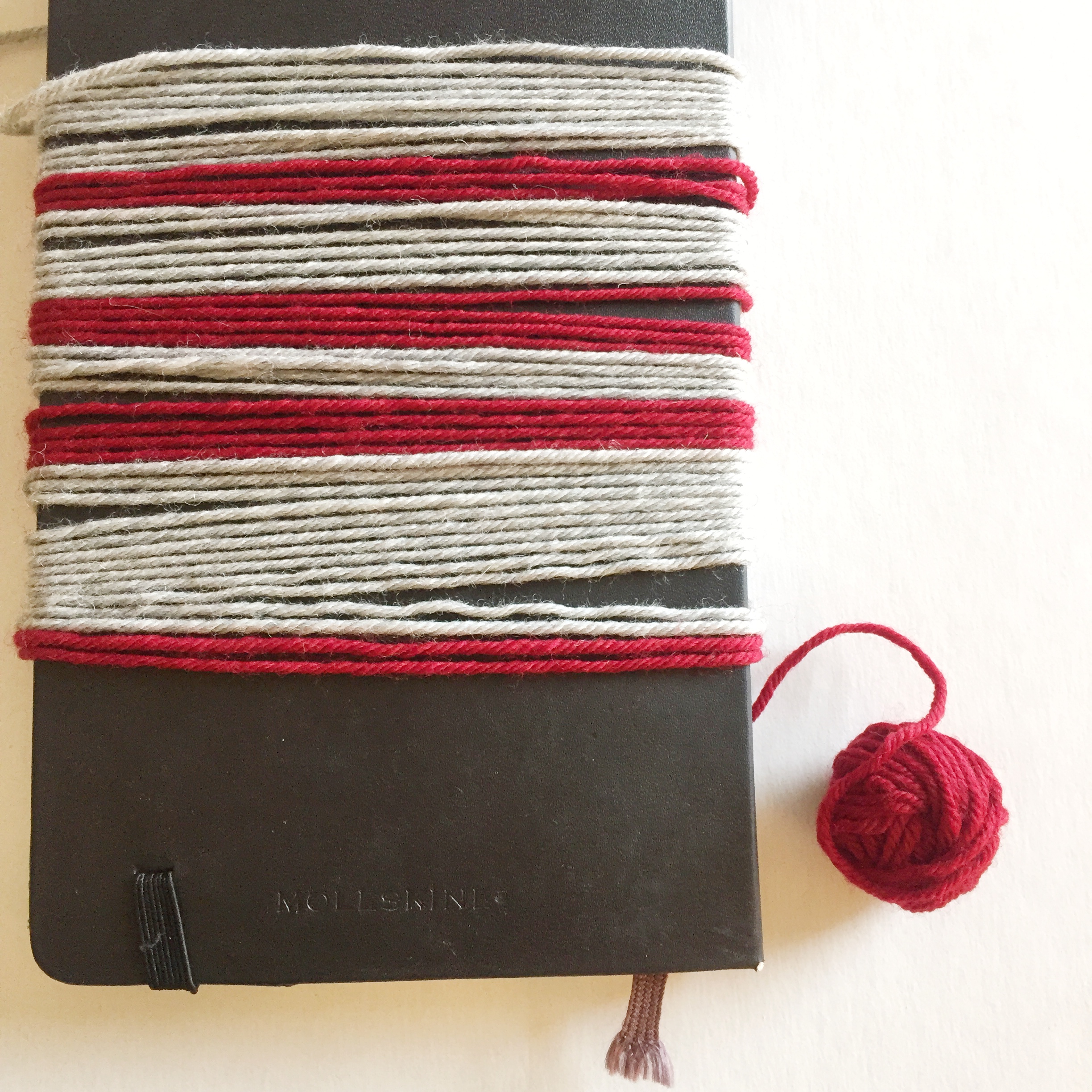
It’s a fast and easy way to look at the possibilities before investing the time in swatching them. I recommend that you take the time to snap a picture of it. I find it amazing how often I can spot a flaw or a lack of proportionality on a photo that I can’t see in the real thing right in front of me.
So what colours will I be doing my second Zig in? Well, I’m going to knit it in three colours. Because it’s my hat. :-) I’m just in a mood to play. Everyone in my family steals each other’s black and grey hats from our knitwear bins in the front entrance, so I figured I’d go with black, silver, and white. I like option #3 best of all.
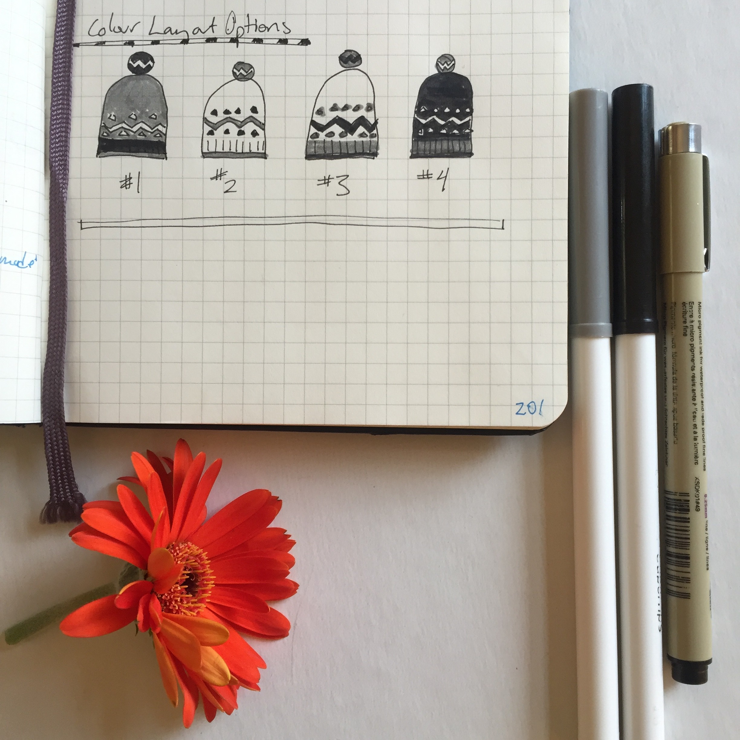
And here are two samples for what that might look like. I noticed in the bottom one that the black seemed to dominate, possibly because it wasn’t repeated often enough. So we will see what I end up doing.
Go play with colours!
If you’re interested in knitting along with me, I’d love to see what you’re thinking of using. Use the hashtag #pomballKAL. Pop into the Ravelry group to show me and tag me on Instagram (@Imagined_Landscapes) or Twitter (@ImaginedLand).
More Pomball Tutorials:
Try Knitting Your Colourwork Hats Inside-Out
But how do I Wash and Block the Pomball?
Even more tutorials on the Knitting Tutorials page.
3 thoughts on “Zig Knitalong: 2 tricks for choosing colours”
Comments are closed.